Release notes

What's new in Cohentis

What changed, in which app, and in which plan.

From initiative to benefit, in one picture

A portfolio has a list of initiatives and a list of goals, and between the two sits a gap that almost nobody writes down. The benefit map draws that missing piece: what an initiative delivers, what the organisation can do once it is there, what changes in reality, and only then which benefit that produces, with what that benefit costs in the same column. The map reads both ways. Left to right it says what we are doing and why; right to left where we want to get to and what it takes. The same nodes, the same lines. And it fills in nothing: where a link is missing the place stays empty, and the map says where the chain stops.

The benefit map of the initiative New care record, with five columns side by side: initiative, output, capability, outcome, and on the right the benefit with the disbenefit beside it. Curved lines connect the nodes from left to right.
Five columns, and on the right the benefit with the disbenefit beside it. Where a link is missing, the place stays empty.

How change portfolio management works →

Who watches the benefit once the project is over

A change effort closes, and the question of whether it worked is left standing. Completion is now a milestone carrying a flag, so it has a date in advance and the portfolio sees it coming; the app never sets that milestone to done by itself. On that day the embedding moves to the portfolio manager, and everything travels with it: per behaviour the carrier and their status, the measurement point with its method, and the trail of who promised what. Then two separate answers are recorded, because behaviour can hold while the benefit stays away and a benefit can land while the behaviour fades. Each carries a name, a date and a sentence saying what it rests on. A term that runs out asks a question, it does not pass judgement.

How change portfolio management works →

Where does that starting number actually come from?

Every success criterion has a from and a to. From now on the app asks one question when you type a number: did you count it, or are you estimating? Both are fine, and an estimate that says it is an estimate is worth more than a measured number nobody can explain. If you counted it, you write down how: which group, which question, how the answers became one value.

Every benefit now points at the objective it serves

A success criterion in a change plan can be linked to a lever in the portfolio: the capability the organisation wants and does not have yet. What the change manager measures travels back to the objective it was about, with the date and the plan it came from. Nothing is overwritten silently. If two plans report a different value for the same lever, the portfolio manager decides which one lands.

One table with every benefit across every initiative

What was promised, where the starting point came from, and where it stands today. One line per benefit, not per initiative, because a plan rarely delivers one thing and collapsing them into a single line is what makes the question unanswerable. Sort it by objective for the board, or by what it rests on to see how much of your portfolio runs on belief.

And what the sponsors would bet on it

Before a benefit can be measured, someone has to believe it will land. The portfolio manager now walks five questions with the sponsor. Is the problem recognised, is the benefit measurable, is it technically possible, can the organisation absorb it, will the behaviour hold? The answer is written down in the sponsor's own words, with how sure they are. The lowest answer decides, because a benefit with four strong answers and one hunch is a benefit with a hunch underneath it.

How change portfolio management works →

The starting point of a success criterion

A goal that moves from "3 of 12 teams" to "12 of 12 teams" only says something once you know how those 3 were counted. From now on every starting point carries its origin with it.

Under the from-value you now find where it came from: the date, who counted and the approach. If it was estimated rather than counted, the line says so, with the assumption behind it. When there are two values they stay side by side: the measurement on top, the estimate that preceded it below. The line under the number tells you at a glance which of the two you are looking at.

The screen "From vision to measurable success criteria" with four criteria. For "Night shift feels prepared" two values sit one above the other: 2.6 measured on 8 September and 2.4 estimated on 9 August.
The same measurement in the third row: 2.6 measured on 8 September, with the 2.4 estimate from 9 August underneath.

On the measurement point's timeline the estimate is the first point, on the day it was written. A dotted ring rather than a diamond, because a diamond is a measurement and this is not one. It does not count towards "on rhythm" and draws no trend line. Once something has been measured, the BASELINE label moves to the first measurement and the estimate stays as history. A legend under the strip names the marks that are there, and only those.

The timeline of a measurement point: a dotted ring with the estimate 2.4 from 9 August, a filled diamond with the measurement 2.6 from 8 September carrying the BASELINE label, and an open diamond for the measurement on 16 October.
The estimate opens the series as a dotted ring. The BASELINE label sits on the first real measurement.

One amber line among the blind spots adds up the criteria whose starting point nobody counted, including the criteria that carry only a target and no starting point. "Look" opens the success criteria with only those rows, and all of them light up.

Nothing is worked out. No difference, no threshold, no inference from the two values. They stand side by side and the person decides.

More on evidence-based change management →

What this plan asks of the organisation

The levers say what you want to achieve in measurable terms. This card says what that means for the organisation as it runs today.

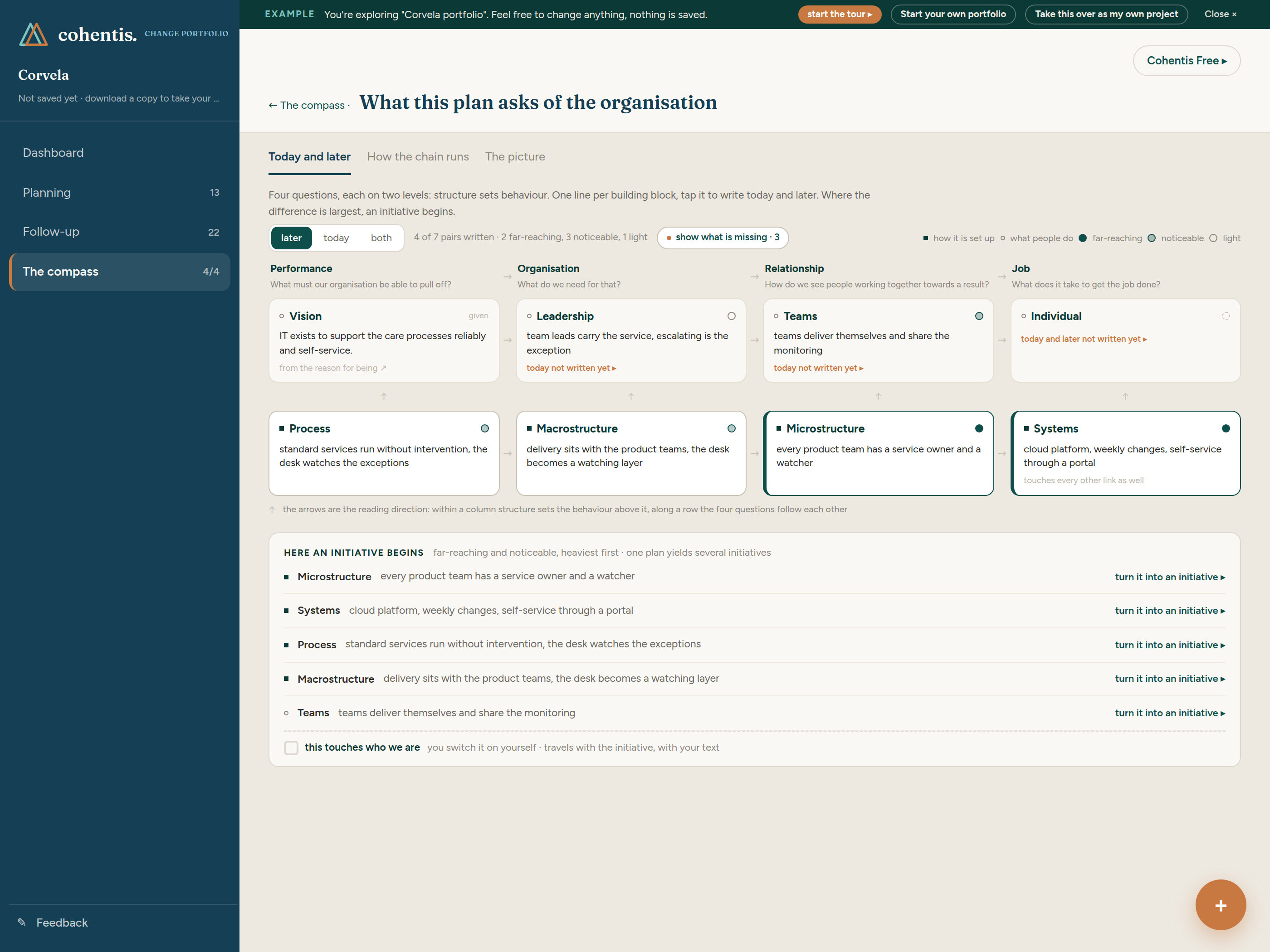
From performance to organisation to relationship to job, and within each column a human building block above a structural one. The upward arrow says: structure sets behaviour. The sideways arrow says: the four questions follow each other. Per building block you write how it works today and how it looks once the plan is in place.

The organisation card's worksheet: eight building blocks in four columns, each with a line about how it works later, and at the bottom the list where an initiative begins.
Eight building blocks in four columns, with the switch between today and later.

You name how big the difference is per building block yourself: far-reaching, noticeable or light. The app works nothing out and never shows a calculated distance. What you did not name is not there. The heaviest building blocks appear as a list at the bottom, and that is where you create the initiative.

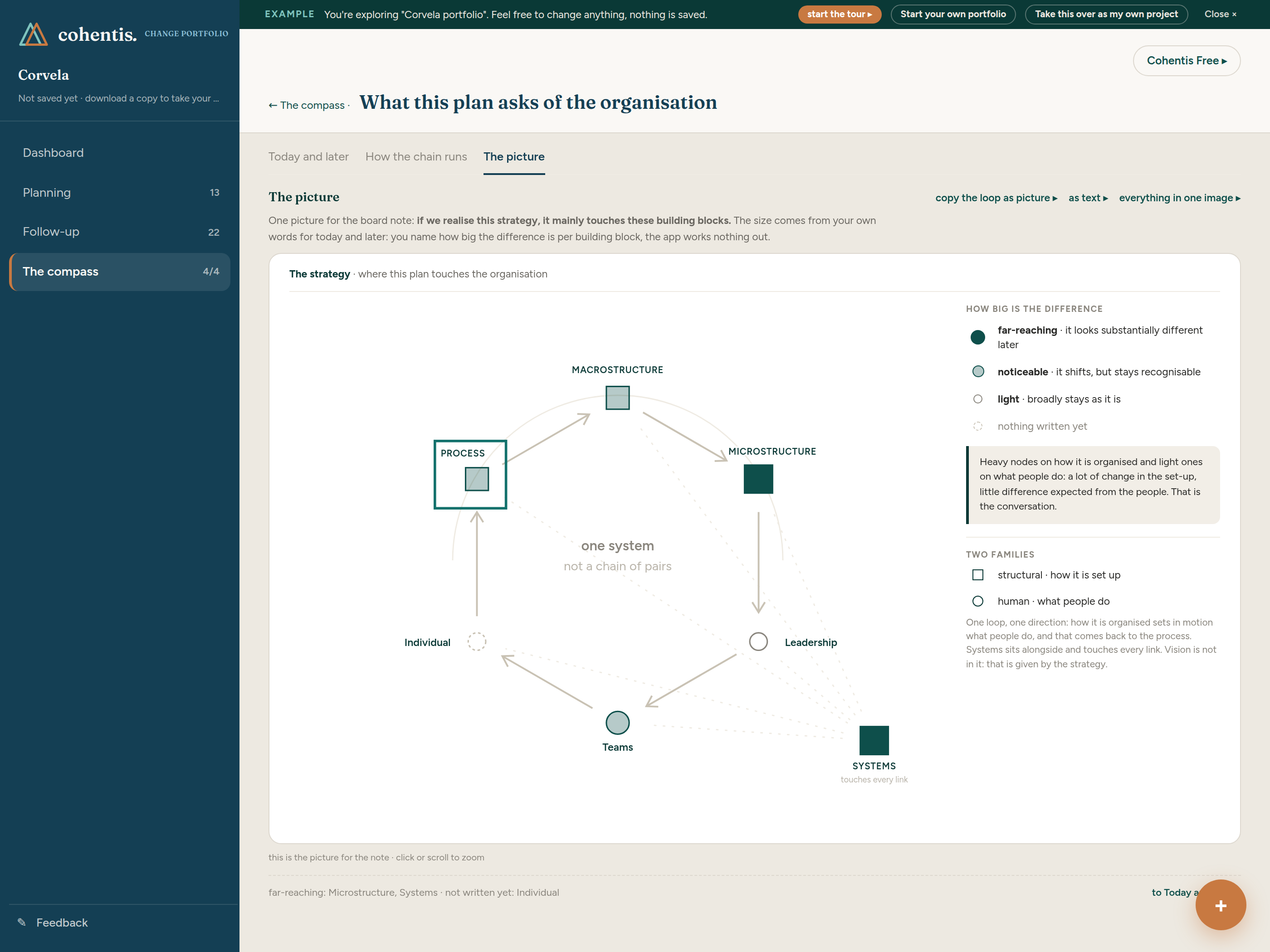
The picture shows the same card as a single loop: if we realise this strategy, it mainly touches these building blocks. Heavy nodes on how it is organised and light ones on what people do reads differently from the other way around, and that is the conversation. Click or scroll to zoom, and take it away as a PNG.

The organisation card as one loop: seven building blocks as nodes, the heaviest filled dark, with the legend of the node size beside it.
The same card as one loop, with the legend of the node size beside it.

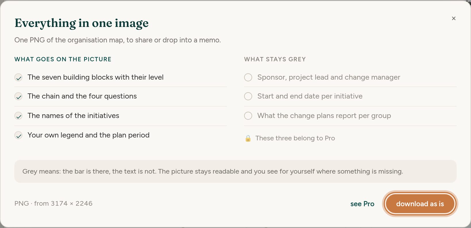
The card is free: filling it in, all the readings, the picture and the export. Three detail lines on the exported picture belong to Pro, because they come from your change managers' change plans: the roles, the period per initiative, and what the change plans report per group. Without Pro a grey bar stands there. The bar is there, the text is not, and the picture stays readable.

The export dialog: on the left what goes on the picture, on the right the three lines that stay grey without Pro.
The export dialog: what goes on the picture, and the three lines that stay grey without Pro.

How change portfolio management works →

Change portfolio: a second app for all the change at once, and it is free

Change portfolio management means keeping sight of every change running over one organisation at the same time: which groups are carrying how much, what collides next month, and what actually held from the one before. That is a different question from the one a single change plan answers, and until now no Cohentis screen answered it.

Change plan runs one change from vision to anchoring. The portfolio sits above it and answers which group is getting four things at once this month, who is carrying them, and where two initiatives land on the same people in the same week. That is a different person with a different agenda, usually a change portfolio manager, a transformation lead or the person who happens to hold three changes at the same time. It is not an extra screen for the change manager.

The portfolio has its own file, its own colour and its own menu with four entries: dashboard, planning, follow-up and the compass. It is free, like the change plan and the mission app. If you touch nothing on the start card you begin a change plan as always, so nothing changes for the work you already have.

The promise is the same one that holds for every part of Cohentis. No account, no server, and the portfolio is a file on your own device that you can hand over, copy or delete yourself.

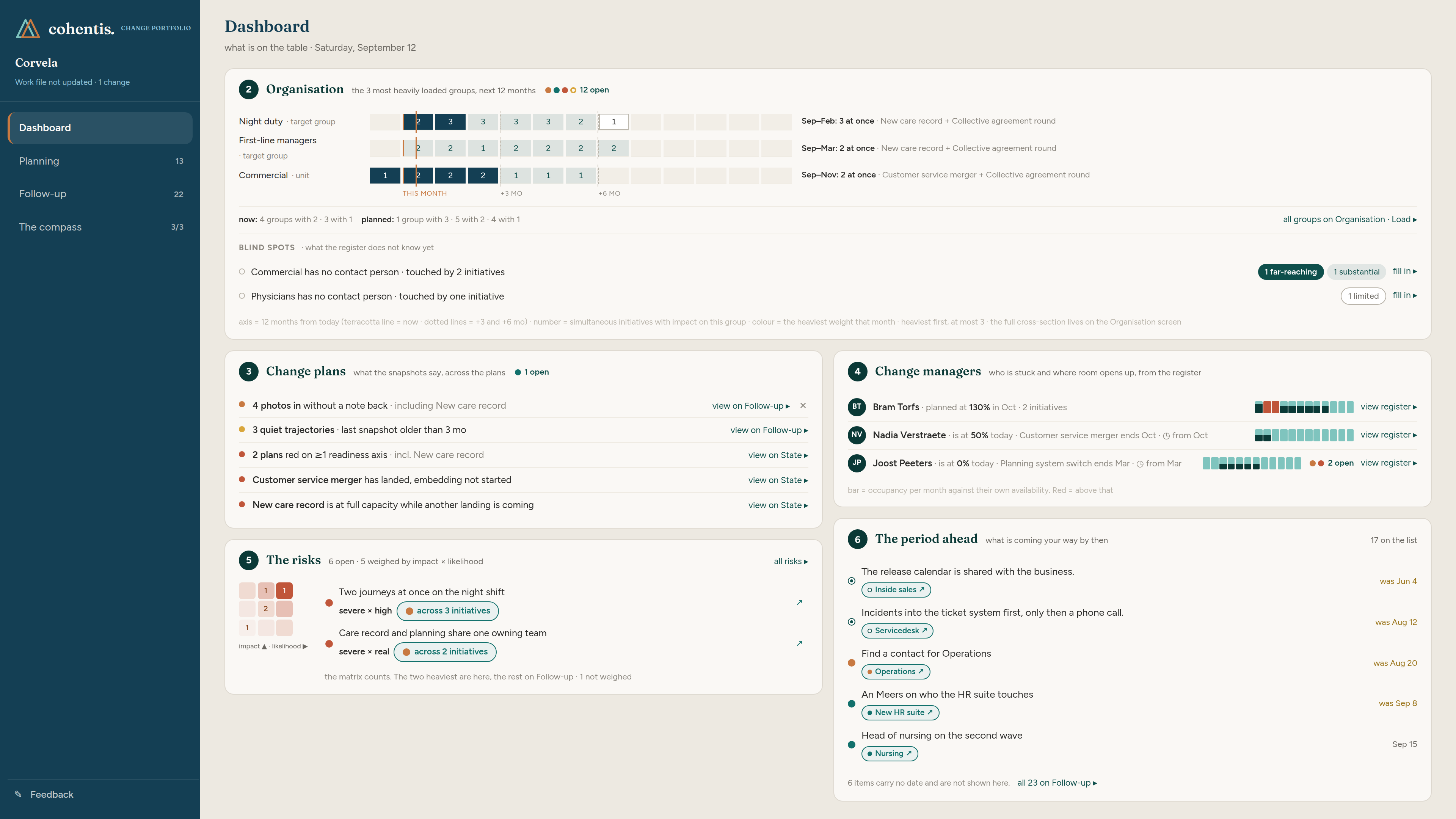
The Change portfolio dashboard in Cohentis: the load per group over twelve months, the change plans, the change managers, the risks, and what is scheduled for the period ahead.
The dashboard opens with the three most heavily loaded groups over twelve months, then with what is still open.

How change portfolio management works →

How the three apps exchange work: one file type, three directions

Upward, the change manager sends the work file and the portfolio derives its own snapshot from it. The portfolio does not ask for a report and the change manager does not fill in a form. What already exists in the plan becomes the snapshot.

Downward, an environment note comes back. It informs and it does not instruct, and it cannot write anything into the change plan. The change manager reads what else is landing on their groups and decides for themselves what that means for their waves.

Sideways, a mission file goes to the change agent and comes back filled in. Merging what came back is free in every version; the Pro licence only applies it for you instead of you working through the overview by hand.

There is one file type on purpose. A second format would be a second truth within a month, and then two people looking at the same group would be reading different numbers.

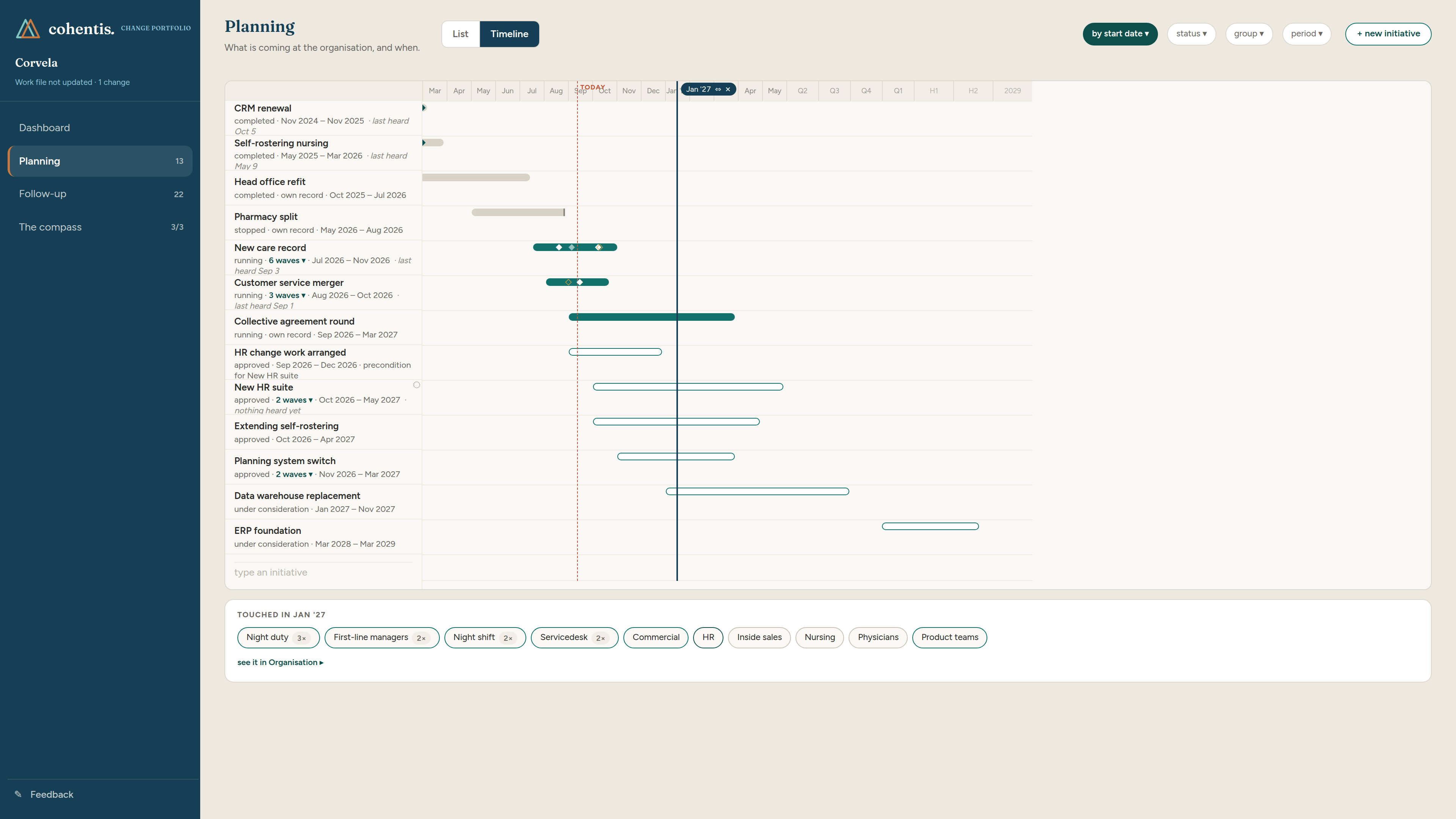
Drag a line across the timeline and see which groups are hit that month

Every initiative sits on one timeline: running, approved, still under consideration, completed and stopped. The status is in the shape of the bar rather than in a colour that judges. Running is filled, coming is outlined, gone quiet is striped, stopped is cut off. The same data opens as a list when you want to manage rather than read.

The cross-section line is a vertical line you drag across that timeline, with a handle carrying the month. Underneath it a card tells you which groups are hit in that month, with a counter where several initiatives land on the same one. This is the answer to the question a project portfolio cannot answer: can this team take on anything else right now.

There is no total and no colour sum. Four light impacts are not one far-reaching impact, and the app leaves that judgement to the person looking. Where an initiative has no impact picture yet, a visible gap appears with a jump next to it, rather than an empty field suggesting there is nothing.

Impact per group sits next to the initiative as weights, never added up into a single score.

The Cohentis planning timeline with thirteen initiatives, the cross-section line on January 2027, and the card underneath naming the eleven groups hit that month.
The cross-section line on January 2027, with the eleven groups hit that month listed underneath.

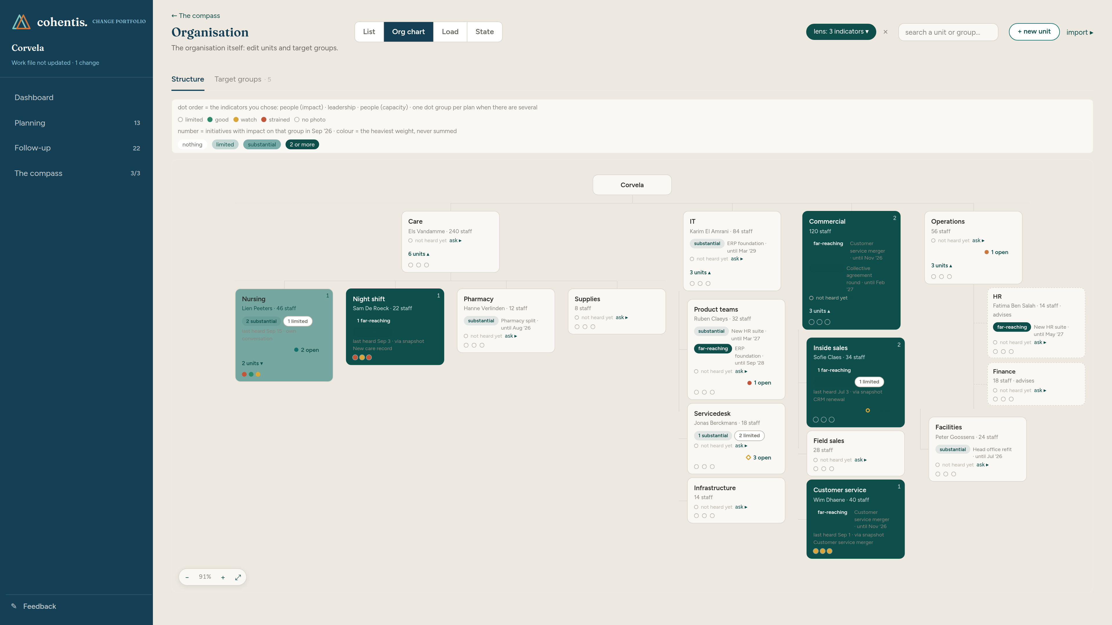
The org chart, with the load of this month on every unit

The organisation screen holds two things on two tabs: the structure a proposal talks about, and the target groups it actually touches, which cut across that structure. Night duty is not a department, and the collective agreement round lands on it anyway.

The org chart is a canvas that fans out where the organisation branches and stacks where it stops, with four views: list, org chart, load and state. With the lens on, each card carries a colour for the heaviest weight landing on that unit this month, a row of dots for three indicators you chose, what is still open, and when that group was last spoken to.

A structural unit can be marked as a target group itself, so the target group register only carries what genuinely cuts across the structure. Archiving lifts the branch underneath one level up, so nothing ever ends up unreachable.

Where a unit has no contact person and is touched by two initiatives, the screen says so. A blind spot is stated rather than left as a quiet gap.

The Cohentis org chart with the lens on: card colour by the heaviest weight this month, three indicator dots per unit, and what is still open per unit.
The org chart with the lens on: colour by the heaviest weight landing that month.

The first fill goes through your own AI, and nothing lands unconfirmed

Setting up a portfolio for an organisation of several hundred people used to mean an evening of data entry. Now you fetch an instruction from the app, paste it into your own AI together with your own org chart or initiative list, and bring the answer back. The AI points out which line is about the same thing, even when the name has changed since the last time.

Two things hold, and they are the difference with almost everything else in this category. There is no AI inside Cohentis itself, and nothing lands without you confirming it line by line. An import only ever adds, and it never overwrites quietly.

That is also why the app costs nothing on this front. You probably already pay for an AI licence, and there is no reason to pay a second time for a model wrapped inside a tool. Where AI genuinely helps, you use your own.

Because the app runs on your device without a server, your org chart never travels to us. What you paste into your own AI is your own decision, in your own account.

Working agreements as a rule the dashboard can check

Working agreements used to be free text, which meant nobody could check them. Where an agreement is a choice or a number, it is now stored as one: guidance form, preconditions, rhythm, months of anchoring. The dashboard then shows what does not match, with the names of the initiatives causing it.

This is not the app judging your organisation. It is your own rule held against your own data. If you have not set an agreement, nothing appears, because no agreement is no signal.

That distinction matters for anyone who has watched a maturity dashboard turn into a scoreboard. Cohentis shows and counts; the reading is yours.

Who is carrying what, and the first month room opens up

The register is the one place in the portfolio where the role of change manager is written down. Per person you see what runs on their name, split by guidance form, and when room opens up: twenty percent today if that is the case, otherwise the first month in which a trajectory ends.

There is no total score, no occupancy bar and no colour on full or empty. This is a planning picture and not an assessment, and that line stands on the screen itself, not only in a release note. A register of people otherwise turns into a scoreboard on its own.

It feeds the guidance call per initiative: does this one need a dedicated change manager, a coaching one, or is the project lead enough. Whoever sometimes answers that no guidance is needed is believed when they say the next one does.

The compass: where this unit is heading, and how change is done here

Underneath the initiatives sits a slow-moving layer. Where does this unit want to go over the coming years, and how is change supposed to be done here. Without that, every initiative arrives as a loose request and every guidance call starts from nothing.

Everything in the compass carries a period instead of a date, so the next plan can be entered before the running one ends. The organisation screen and the change manager register open from here, which makes the compass a level rather than a screen.

This is also where the track record accumulates. Each finished change feeds the call on the next one, including the ones where something quietly bled to death.

Follow-up: actions, measurements, anchoring and risks, grouped per group

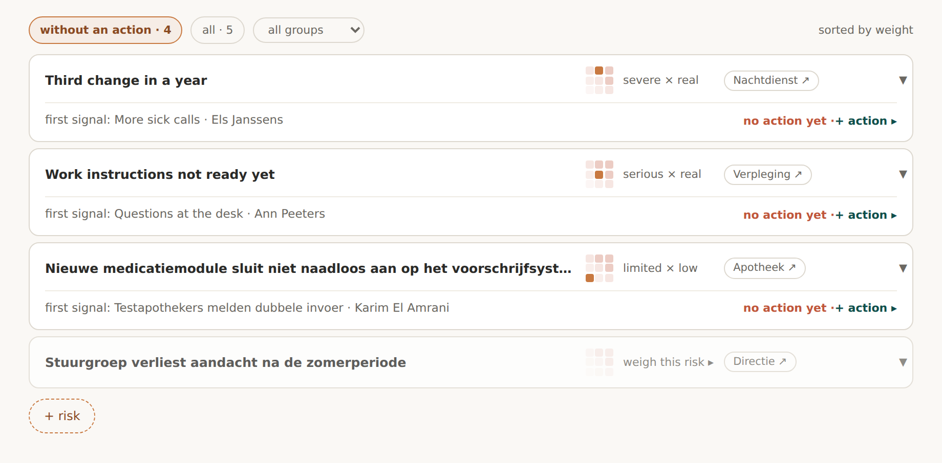
Follow-up gathers actions, measurements, anchoring agreements, notes and risks, grouped by the group they belong to rather than by the type of item. That is the order in which a portfolio manager thinks: not all the risks, but everything that touches night duty.

The cells of the risk matrix are buttons. Click one and you stand in the list with that cell as the filter, so impact times likelihood becomes a way in rather than a picture on a slide.

The setup wizard: five steps to a working portfolio

The wizard walks through the organisation, the decision level, the initiatives, the change managers and a reading step. What you type is immediately the register, so there is nothing to save and nothing to lose if you stop halfway.

Combined with the AI import, a portfolio for a few hundred people is a job of minutes rather than an evening, and every line that lands has been confirmed by you.

Change mission, the app the change agent takes into the field

The mission app existed but was not finished. It now has its own colour in the shell, its own feedback route, two intro screens, a demo carrying real data, and a guided tour of fourteen steps that walks past every subgroup of the target group.

The change agent opens a mission file without an account, on a phone as well. The context travels with it: the planning, the risks, and where the group stands. During the conversation the agent captures what each voice says, and the harvest goes back as a file.

Habit and capacity were added as root causes, next to the five Rogers characteristics. A group can now say that the old way runs deep or that there is no time and attention beside it, which are the two answers people actually give and which the five characteristics did not cover.

This is the person who wants the least to do with software and knows the most about what lives in the group. Everything in this app is built around that.

Also improved: tours, search, French typography and month names

The guided tour now runs through all three apps instead of only the change plan, and every demo opens with two intro screens rather than dropping you into a stranger's file. Eleven dropdowns were replaced by the search field of the app; on one screen there were ten lists of twenty-four units under each other.

A copywriter went through every text: 1,298 corrections across three languages, of which 932 in French, largely typography and a consistent form of address. Four labels stood untranslated on screen, and at the closing balance they sat as text in the code rather than in the translation files, so no language round could find them.

Month names showed in Dutch on the French and English timelines whenever a file had not been saved yet, because forty-three places in the code fell back to Dutch. That is fixed at the two points where everything passes through. Anchoring became a type of its own, with its own tab and its own place in the create menu, and the wizard, the compass panel and the tab bar read on a phone again.

Evidence-based change management, from signal to action

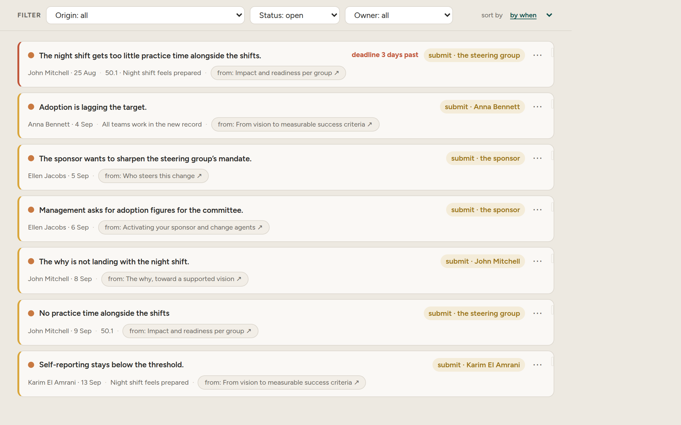
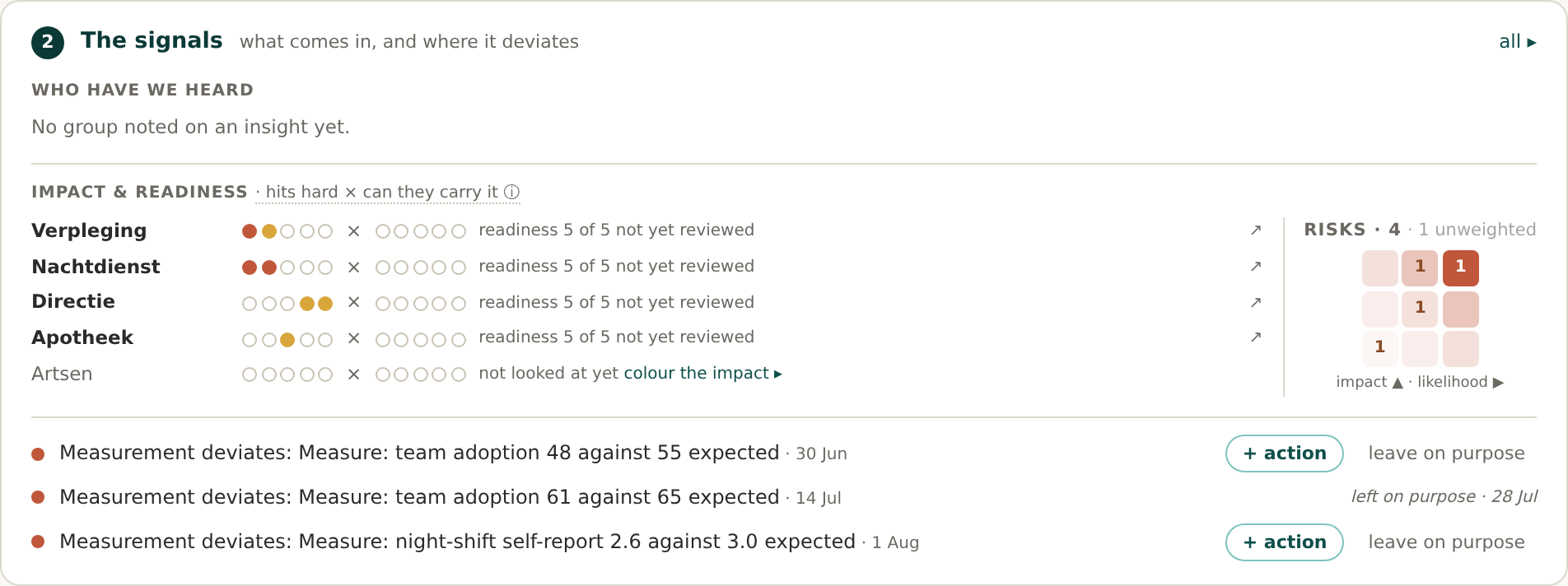
Your weekly session now starts with your own data. The dashboard shows what is alive: which group sits in the red zone, where a measurement deviates from the target line, what you have not filled in yet. Every signal comes from your change plan, not from an assumption.

When a signal speaks to you, one click turns it into an action, a risk or a conversation. That is how evidence-based change management (OCM) becomes concrete: you steer on what was measured and heard, with the evidence beside you.

The Cohentis dashboard as the agenda of the weekly session: a list of signals from your own data, each with a button to take it over as an action or risk.
The dashboard as agenda: what is alive, what is running, and what you still need to fill in.

More on evidence-based change management →

What your teams say, gathered per group

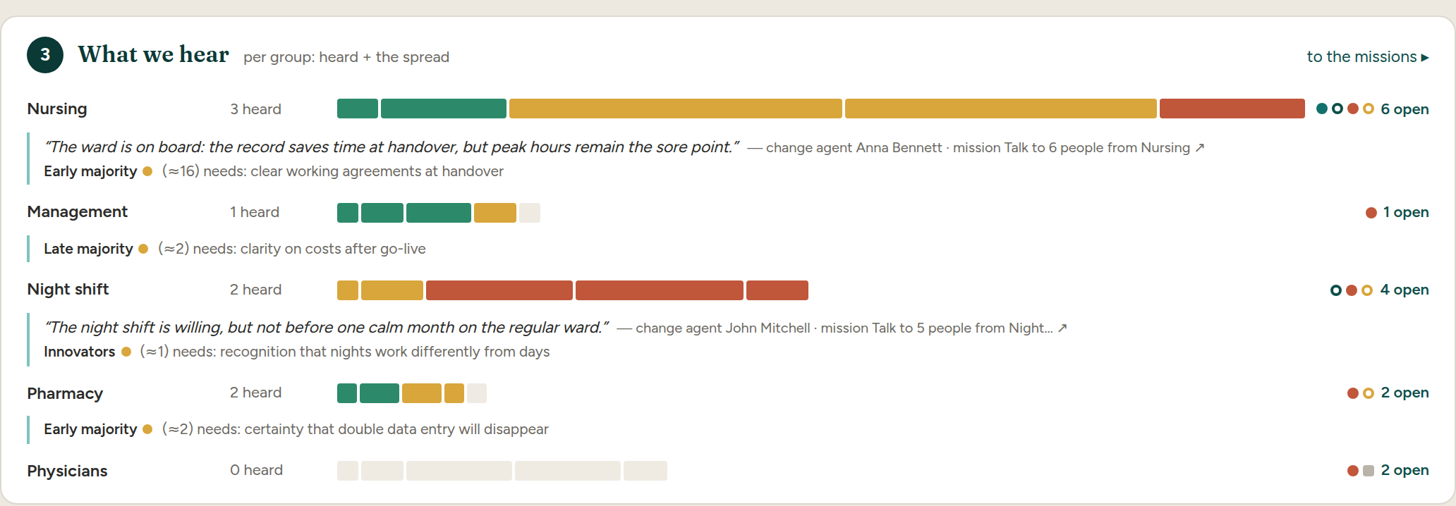
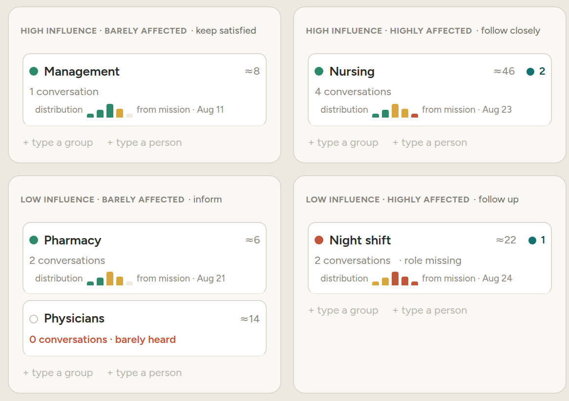
A number tells you adoption is stalling, not why. The what we hear block gathers, per group, the spread of attitudes, a telling quote, and what that group needs to come along. So you see not just that a group lags behind, but what holds them back.

The insights come from conversations on the front line, brought back to your change plan in a structured way. Who you spoke with stays private on your device, only the pattern travels.

The what we hear block in Cohentis: per group the number heard, a spread bar of attitudes, and a quote from a conversation.
Per group the spread of attitudes, a quote, and what that group needs.

More on the stakeholder map →

Tracking change adoption with measurements and a target line

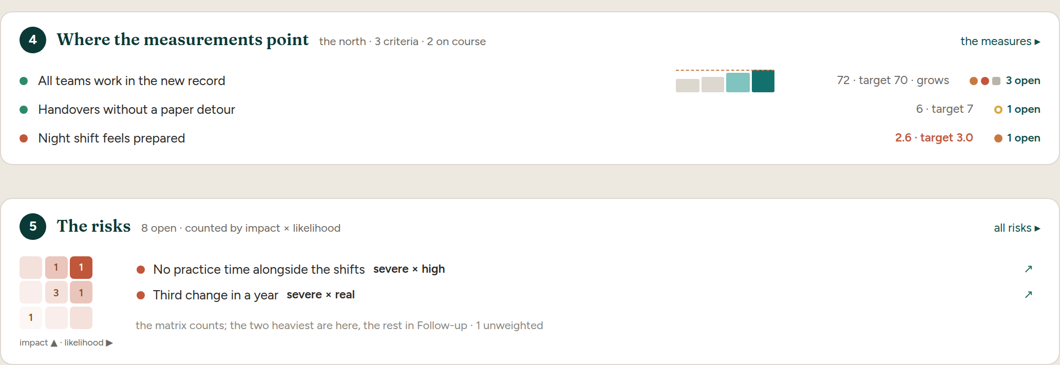
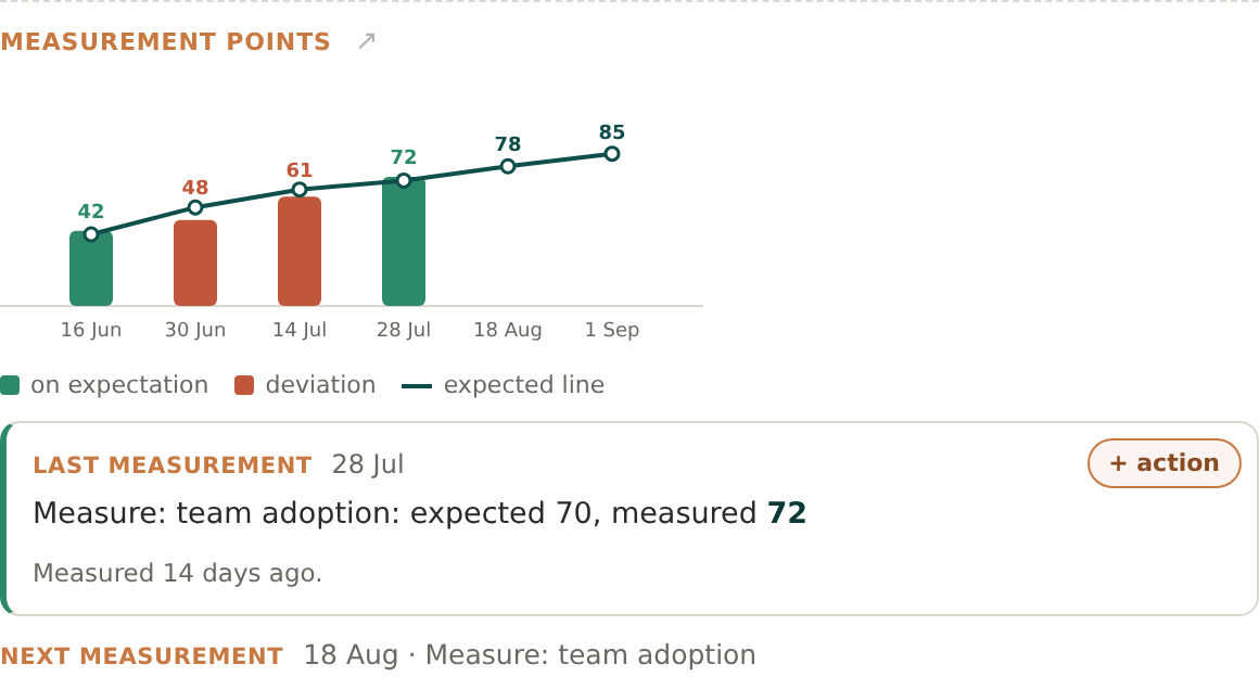
You record per measurement point what you expect and what you observe, at a rhythm that fits your change initiative. The chart shows where the measurements point, with the target line alongside, so you see early whether adoption is on course or bending away.

Each measurement point hangs off your change plan, so a deviation points straight to the group and the milestone it touches. No separate dashboard to keep, it sits in the plan itself.

The measurements screen in Cohentis: a series of measurement points with expected and observed values, and a target line showing the course.
Where the measurements point, with the target line showing the course.

More on the change management approach →

Change risks as an impact-by-likelihood matrix

The risks of your change initiative now sit in an impact-by-likelihood matrix, so you see at a glance which ones really matter. You record beside each risk the assumption underneath it, and you test that assumption as you learn more.

A risk you confirm or disprove points back to the measurement or conversation it came from. So your risk management stays tied to what is really at play, not to a loose list.

More on risk management in change →

A stakeholder map with buy-in per group

You start with who steers the change and widen to who it touches. The stakeholder map orders each group by impact and influence, and shows buy-in per group, so you see where your attention is needed most.

Names come from one shared register, so a person you add here you recognise everywhere in the app. No double lists, no copying.

The stakeholder map in Cohentis: groups ordered by impact and influence, with an indication of buy-in for each group.
Each group ordered by impact and influence, with buy-in per group.

More on the stakeholder map →

Impact and readiness in one grid

Per group you record in one grid how large the impact is and how ready they are, across the axes that matter: people, processes, technology, structure and policy. A group in the red zone shows why straight away, without a click through.

What you estimate here is your starting picture. The floor may confirm or refute it, and the grid shows the gap between what you expected and what you heard.

The impact and readiness grid in Cohentis: per group coloured levels for impact and readiness across several axes.
Per group the impact and the readiness, across the axes that matter.

More on evidence-based change management →

Roles that mean something: sponsor and change agents

Roles are now real assignments, with a history. You activate a sponsor and change agents, each with a panel per person, so it is clear who stands for what and since when.

A change agent you activate here can later run listening missions on the front line. The role is not a label, but a starting point for real work.

More on the change management approach →

Delegating the listening to change agents

You send a listening mission to a change agent, with all the context. They hold the conversation where the work happens and bring the harvest back in a structured way, so you do not have to run every conversation yourself to know what is alive.

The mission file looks like a document, not a form. The agent fills it in with you and sends it back, and you choose line by line what to take into your change plan.

The follow-up screen in Cohentis: a listening mission ready to send to a change agent, with the harvest coming back structured.
A listening mission sent out, and the harvest coming back structured.

More on the stakeholder map →

The change plan as a tree with milestones and measurement points

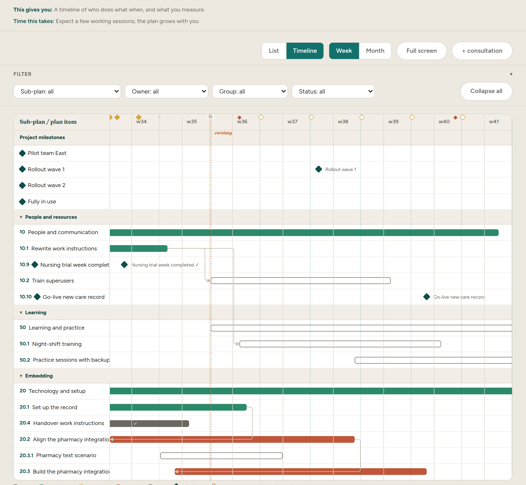
Your planning now stands as a tree: phases branching into tasks, with milestones and measurement points in their place. What is running starts with one line about your planning, so from the dashboard you land straight on the right branch.

Every item in the change plan can point to its evidence: the measurement that tests it, the conversation that touches it. So the plan stays a living whole, not a static chart.

The planning screen in Cohentis: a tree structure of phases and tasks, with milestones and measurement points in their place.
The plan as a tree, with milestones and measurement points in their place.

More on starting a change initiative →

Anchoring change so the behaviour stays

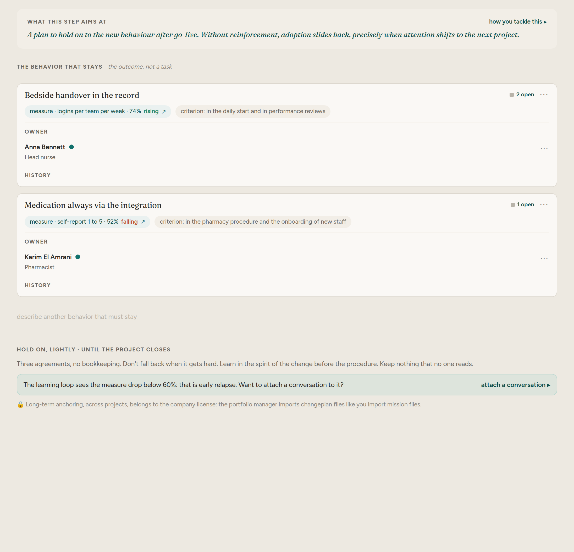
A change is only done when the new behaviour stays without you pushing on it. In the anchoring block you record per behaviour who owns it and how you can tell it sticks, so the change does not spring back once the attention falls away.

Anchoring hangs off your change plan, so you see which behaviour still lacks an owner. Not a separate aftercare document, but a keystone in the plan itself.

The anchoring block in Cohentis: per behaviour an owner and a signal by which you can tell it sticks.
Per behaviour an owner, and how you can tell it stays.

More on the change management approach →

One place for seven kinds of work

Actions, conversations, missions, risks, assumptions, measurements and notes now sit in one place. The plus button attaches to whatever you have selected, so a new action or note lands in the right spot straight away.

Every counter clicks through to the same filtered list, and you can flag an item for yourself. So you keep seven kinds of work together without it becoming an archive.

More on the OCM dashboard →

A privacy-first change management tool you can install

Cohentis is a free, online change management (OCM) tool you install as an app on any device. There is no password, no email and no user database, your work stays in one file on your own device. Privacy-first, not as a promise but by design.

To work with a team, you take a Pro licence, manage your devices, and get out again if you get stuck. Reports for three audiences, and guided tours and help right where you are.

See the licences →

Conversations as evidence

A dashboard can tell you adoption is stalling. It cannot tell you why. The app now treats conversations as evidence: capture what you hear in two minutes, see recurring themes, and spot who you have not heard from before blind spots become resistance.

Every insight links back to the conversations behind it, so decisions rest on what was actually said. Who you spoke to stays private on your device; only the pattern travels.

Sensing overview in Cohentis: which groups have been heard, with the number of voices per group, next to the adoption curve that marks the gap at the early majority.
Who you have heard, per group, next to the adoption curve that shows where the gap is.

More on evidence-based change →

Listening missions for change agents

Send your team out to listen. Create a mission with a target group, a goal and open questions, and hand each change agent a small mission file. Agents capture conversations on any device, free and without an account.

The Pro licence adds the merge: bring every returned mission file back into one picture with a single import, conflicts flagged, plus reports without the watermark. A passkey opens it, so still no accounts and no user database.

More on the sensing network →

Seeing blind spots: who you have not heard from yet

Support is not measured only by who says yes the loudest. The app keeps track, per group, of how many voices you have heard, and shows your listening ratio: how much you send against how much you gather. The groups you have not spoken to stay at the top.

That way you recognise a blind spot before it becomes resistance, and you know where your next conversation pays off most.

More on finding blind spots →

Risks in one place, with impact and likelihood

The risks of your change project do not belong scattered across loose notes. You now capture them in one register, each with an impact and a likelihood, and see them together in a three-by-three grid. That way you know at a glance which risk needs attention first.

Every risk gets an owner and a status. What you keep here travels into your change plan report, so the steering group has the same risk analysis in front of them as you do.

Risk register in Cohentis: risks of a change project weighed by impact times likelihood in a 3×3 grid, sorted by weight, with the group involved per risk.
The risk register: each risk weighed by impact times likelihood, heaviest on top.

Spot change fatigue early, not at the drop-out

Too much change at once wears a team out. The app derives a picture of resilience per group from your sensing, so change fatigue becomes visible before it hits the schedule.

You see where the give has gone and can ease the pace or put an honest go/no-go on the table, instead of pushing on until it breaks.

More on resistance and change fatigue →

One change dashboard: your north, your signals, this week

Scattered overviews help no one. The dashboard brings your change project together on one screen: your north with the success criteria, the signals that need attention, and what there is to do this week.

Every signal is clickable and takes you to the place where you resolve it. That way you know where you stand at every opening, and what the next step is.

More on the OCM dashboard →

Measure adoption per group, and see where the gap is

Adoption is not a single number. Per affected group you now see an adoption curve: how many people are on board, how many still follow, and how wide the gap is between where you want to be and where you are. On the dashboard the curve runs along small, so you adjust early instead of explaining it afterwards.

The curve leans on your own leading indicators and measurement points, not on a guess. A group that lags becomes visible before it turns into resistance.

Adoption · per group
78%Front-desk staff
54%Back office
31%Night shift
Target end of Q3: 70%Gap: night shift, back office
The adoption curve per group: who is on board, who still follows, and where the gap with your target is.

More on measuring adoption →

Success criteria with leading and lagging indicators

How do you see that the change is taking hold, and do you see it in time? Per goal you set a success criterion with a leading indicator that moves early and a lagging indicator that confirms the result, each with a measurement point.

That way you steer on early signals instead of counting only afterwards, and you back every decision with what you have measured.

Measurement points of a success criterion in Cohentis: adoption per team over time, with measured values on and below expectation against the expected line.
The measurement points over time: measured values on and below expectation, against the expected line.

More on leading and lagging indicators →

Test assumptions instead of hoping they hold

Every change plan rests on assumptions. You make them explicit, give each assumption a status from exploring to confirmed or refuted, and link the evidence you gather along the way.

That way you know which beliefs still need testing, and you build your change plan on what holds instead of on what you hope.

More on testing assumptions →

A design group that listens on a rhythm

A change carries further when a standing design group carries it with you. You put the members together, pick a sponsor, and give the group a rhythm: which day, which hour, how often. That rhythm shows up as session lines on your schedule.

Measurement points shift along to the next session, and a session that did not happen stays visible with the reason attached. That way your sensing rhythm stays honest, even when it slips once.

More on the design group and sensing →

Your playbook and change calendar on one timeline

A change has a rhythm in time. You put your steps, milestones and measurement points on one timeline, with an anchor date and the run-up to it. Measurement points hang on the work they belong to.

That way you see dependencies and crowding in advance, and you plan your communication, training and measurements for the moment they count.

More on the change plan →

Two worked example projects

Learning the method is easier inside a real project. The app now ships with two filled-in example projects to practise with, one of them with a listening mission mid-flight.

Impact analysis: who changes what, and how hard

A change hits every group differently. In a grid of groups against domains you record where the impact is heavy and where light, from process and system to role and behaviour.

That way you know where the load falls and tune your approach per group, instead of giving everyone the same message.

More on readiness per group →

Stakeholder map with impact and readiness per group

Who does this change affect, and how ready is each group for it? You map your stakeholders by influence and impact, and assess the impact and the readiness per group. Groups with high impact that are not yet at the table light up.

That way your stakeholder analysis becomes a working picture instead of a list: you see at once whom you bring along, whom you protect, and where you plan a conversation first.

Impact and readiness overview per stakeholder group in Cohentis, with a 3×3 risk summary alongside: groups with high impact and low readiness light up at the top.
Impact next to readiness per group, with a 3×3 risk summary alongside; the groups you still miss on top.

More on stakeholder mapping →

The sponsor gets a fixed place in your plan

A change without a visible sponsor loses speed. You name the sponsor from the first step, and that role runs along in your compass and your design group without you filling it in again each time.

That way it stays clear who carries the change and who takes the decisions, for you and for the groups you bring along.

The compass: your change plan in five steps

A change plan does not have to be an empty template. The compass leads you in five steps from your foundation to your success criteria, your stakeholders, your assumptions and the impact per group. Every step builds on the previous one.

At the end you do not have a document that gathers dust, but a change plan that moves with what you learn along the way.

More on building your change plan →

Presentation mode: your change plan as slides

For a steering group or leadership you switch your change plan to slides in 16:9 with one click. The same content, ready to show, without building a separate presentation.

That way you discuss your plan on screen as it is, and there stays one source instead of a deck that starts living next to reality.

From blank screen to starting picture in six steps

Starting is the hardest part. A new project now opens with six short questions: what the change is about, who it affects, how you see that it works, what you assume, and with whom you test that. In a few minutes you have a starting picture you can share.

Every answer lands straight in its place: in your compass, your stakeholder map, your success criteria and your assumptions. You do not fill in the same thing twice.

From project to line: anchoring the change

A change only succeeds when it stays without you. You record which behaviour has to be anchored, measure it on a core behaviour, and plan the handover to the line and the wind-down of your support.

That way your project does not end with a go-live but with a line that takes over, with evidence that the behaviour sticks.

More on anchoring change →

Your change plan as a shareable report

Your work deserves a form you can show leadership. You pour your change plan into one shareable report: a self-contained HTML page without an account, with a fixed structure and a decision log. Per audience you choose what you show.

The mission report is free; the change plan report without the watermark comes with the Pro licence.

Your whole change plan in one file, without an account

Change management software usually asks for an account and a database with your people in it. Cohentis does not. Your whole change project lives in one HTML file that you keep and share yourself, without registration and without names leaving the door.

The free version works fully locally; the Pro licence opens with a passkey. That way you keep control of your data and privacy stays a starting point, not an afterthought.

More on privacy and your data →

Frequently asked questions

Is Cohentis free?

Yes. You map a full change project, measure adoption and produce a mission report without paying and without an account. The Pro licence adds merging mission files and the change plan report without the watermark.

Does Cohentis work without an account?

Yes. Your whole project lives in one HTML file that you keep and share yourself. There is no registration and no database of your people. The Pro licence opens with a passkey.

How do you measure adoption in Cohentis?

You set a success criterion per goal with a leading indicator and measurement points over time. Per affected group you see an adoption curve with the gap between where you want to be and where you are, so you adjust early.

What is the difference between the free version and Pro?

The free version runs fully locally: your change plan, stakeholder map, measurements and the mission report. Pro adds merging returned mission files and the change plan report without the watermark, opened with a passkey.

Who is Cohentis for?

For change managers, project leads and sponsors who want to steer change on evidence. You map stakeholders, test assumptions, measure adoption and keep risks in one place.

What is a benefits baseline in change management?

The measured or estimated starting value of a success criterion, recorded before the change begins, together with how it was determined. Without it, the difference measured afterwards has nothing to be a difference from.

How do you link a change initiative to a strategic objective?

By pointing each success criterion at the capability the organisation wants to gain. What the change manager measures then returns to that objective, with the date and the plan it came from.

Why should you not add up benefits across a portfolio?

Because benefits from different initiatives are expressed in different units and rest on estimates made by different people with different definitions. A single total hides all of that, which is why boards stop trusting benefit figures.

Who measures whether a benefit landed after a project closes?

Not the change manager, because the project is over. From the completion milestone onwards the watch sits with the portfolio manager, who records two separate answers: whether the behaviour held and whether the benefit landed, each with a name, a date and a sentence saying what it rests on. The measurement method travels with the file, so whoever remeasures can do it the same way.